
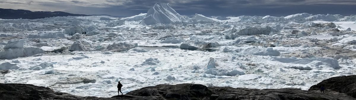
In 2014, John Cook and I were interviewing one of the planet’s most respected and widely quoted Glacier experts Eric Rignot, when he dropped a sentence that left our jaws on the floor, and had reverberations well beyond the room for some months.
Related to the West Antarctica Ice Sheet, he said, “Look, we’ve gathered enough information.. this sector is sort of doomed. It’s going to keep retreating, no matter what the climate does..it might retreat faster, if climate warming continues at this pace, it might retreat slower, we don’t know that absolutely for sure.
But the fuse is already blown.
The idea is still, probably, a little bit of a shock for some people in our community, but I’ve been looking at this area long enough to be quite sure about that.”
Dr Rignot, in our chat of 2017, walked that back just a tiny bit, but it almost seems like recent events have trended toward the more alarming side.
This week we had a similar moment, now on Twitter/X, with a post by Zeke Hausfather.
Zeke is one of the smartest people you’re ever going to meet, and also one of the most moderate and carefully spoken. So, this did jump out at me. (JRA-55, fyi is a Japanese temperature data set)

Mike Mann came out with some moderation and nuance, pointing out that the current El Nino (ENSO) that has been kicking in over the summer is causing quite a pop in the monthly and seasonal anomalies, so some eye catching, if not breathtaking, graphs.


Zeke Hausfather in Carbon Brief, 26 July 2023:
Temperatures are tracking climate model projections
Climate models provide physics-based estimates of future warming given different assumptions about future emissions, greenhouse gas concentrations and other climate-influencing factors.
The figure below shows the range of individual models forecasts featured in the Intergovernmental Panel on Climate Change’s (IPCC) fifth assessment report – known collectively as the CMIP5 models – between 1970 and 2030, with grey shading and the average projection across all the models shown in black. Individual observational temperature records are represented by coloured lines.
In these models, estimates of temperatures prior to 2005 are a “hindcast” using known past climate influences, while temperatures projected after 2005 are a “forecast” based on an estimate of how things might change.

Zeke is most well known for his work as part of the Berkeley Earth surface temperature record project, which does indeed show that, as El Nino has kicked in, there’s been quite a pop in the graphs, comparing month to month, or season to season, historically:

But in the projection for how we will finish in 2023, while it may be the hottest year in the record, that record is not so wildly jumping off the chart as the monthly anomalies.

Climate journalist Rob Meyer called Zeke for more clarification:
Rob Meyer in Heatmap:
The chart looks crazy. Does it seem as crazy to you as it would seem to us?
It feels kind of crazy. I mean, people are going to write dissertations about 2023, and just how unusual this year has been for the climate.
Where has this year been worse?
The North Atlantic is the place that really stands out. It’s just so far above anything we’ve seen in that region — it’s hard to know what’s going on there. But we’ve also seen the warmest year to date over China. We’ve seen South America be exceptionally warm. We’ve seen some winter temperatures in Brazil that rival the hottest summer temperatures ever seenthere — although it’s in the tropics, so there’s less seasonal variability there, generally. Australia’s been unusually warm.
Why has this year, in particular, been so hot?
Part of the reason that these summer charts look so crazy is that the most recent big El Niño events that we’ve had have primarily boosted winter temperatures. 1998 and 2016 both had really high December, January, and February temperatures. And we’re probably on track for that as well this year — El Nino is still growing.
But this year, we saw a very dramatic shift from a moderate La Niña — a very unusually long, “triple dip” moderate La Niña that lasted from late 2020 to the start of this year — to strong El Niño conditions over the course of a few months. And so it’s not just the transition from neutral to El Niño that affects temperatures, it’s the swap from La Niña to El Niño. And that’s been part of the story this year, and one of the reasons why you’ve seen such high temperatures this summer.
There’s a bunch of other contributing factors that we’re still in the early stages of precisely quantifying. Those include an uptick in the solar cyclethat happens every 11 years — that has a small effect, 0.05 degrees Celsius maybe. There’s the phase-out of sulfate shipping fuels by 2020, which shouldn’t suddenly affect the summer of this year but which certainly has contributed to more recent warming. And that’s on top of the broad decline in forcing from aerosols — and sulfur dioxide, in particular, that’s fallen about 30% since the year 2000.
And then there’s a bit of a wild card with this Tonga volcano that erupted last year that put a huge amount of water vapor in the atmosphere. Again, most of the early modeling of that shows somewhere in the range of an increase of 0.05 to 0.08 C — a boost to warming, but not the main cause. But I think if you combine the rapid switch from La Niña to El Niño and all these smaller contributors on top of the 1.3 degrees Celsius or so of human-driven warming that we’ve had to date, you can get temperatures this extreme.
So if I understand correctly, the last big El Niño that we had — in 2016, I think — developed during the big Northern Hemisphere summer. Is that right?
It developed a little later than this one developed. But more importantly, it switched more gradually from neutral conditions to El Niño conditions. What is a bit unusual this year is just how rapidly we’ve transitioned from La Niña to El Niño.
Why would making the leap from La Niña to El Niño make the temperature leap worse than switching from neutral to El Niño?
The last three years have been slightly cooler than we would normally expect because of La Niña conditions. And so the jump we see this year is somewhat relative to what we’ve seen in previous years — if the previous summers had been much warmer, than this summer’s jump on the chart would seem less extraordinary.
I see. So part of what we’re seeing is the past three years of warming sort of getting unmasked, so to speak?
Yeah, on top of a big El Niño and those other factors.
I’ve tried to temper my reaction to the spike in temps by considering the coincidental alignment of the 2022 HTHH eruption, the jump in solar output, the sulfate aerosol reduction, etc., then it occurred to me that the increasing background level of greenhouse gases means that future insolation peaks will be magnified in their effect from now on. (Duh.)
https://spaceweather.com/images2023/02jan23/sunspotcycle_strip.png
Someone has to say it:
“I think climate scientists (and journalists) are underestimating people. If you treat people like children who can’t handle the truth, they will behave like children. Like teenagers, actually, wasting time like it’s in endless supply. Yes, there are plenty of people who prefer denial. But I bet just as many want the truth, painful as it is. We deserve a shot at rising to the occasion.”
https://www.wbur.org/cognoscenti/2023/10/03/1-5-degrees-celcius-un-climate-change-report-barbara-moran?utm_source=substack&utm_medium=email