

A popular bonehead meme often heard from climate deniers is, “climate models don’t work and are inaccurate”.
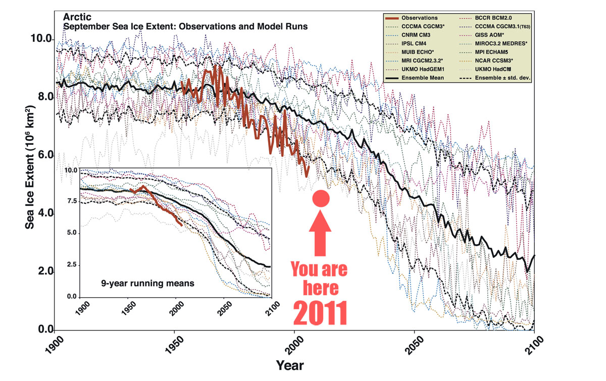
Sadly, in the case of arctic sea ice melt, that’s true – but not in the way we would wish. In the graph above, dotted lines are IPCC models for arctic sea ice melt. Red line is actual observations. Dot is from NSIDC graph of 9/7/11.
Stroeve et al, Geophysical Research Letters, 2007:
From 1953 to 2006, Arctic sea ice extent at the end of the melt season in September has declined sharply. All models participating in the Intergovernmental Panel on Climate Change Fourth Assessment Report (IPCC AR4) show declining Arctic ice cover over this period. However, depending on the time window for analysis, none or very few individual model simulations show trends comparable to observations.
38 thoughts on “Graph of the Day: Arctic Ice Melt – How Much Faster Than Predicted?”